

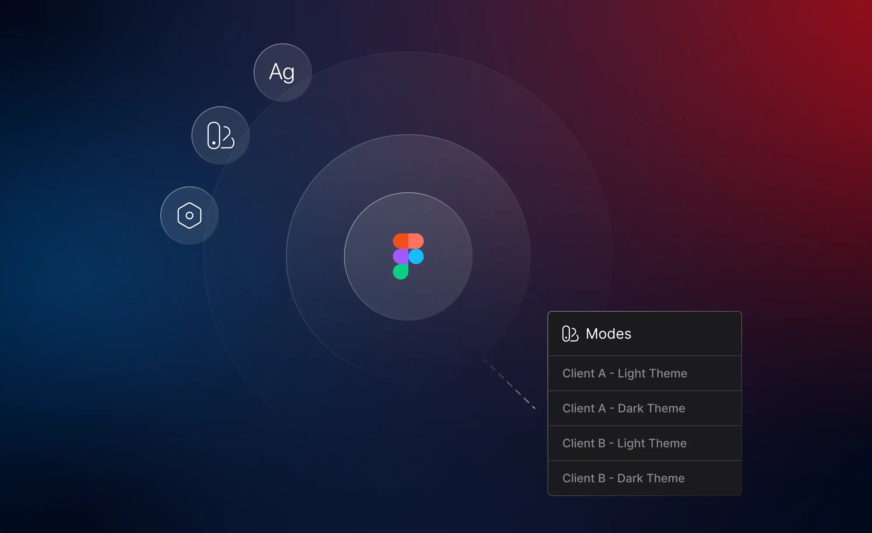
What a Multi-Theme Design System Is and Why It Matters
A multi-theme design system is a foundational design system built to support multiple visual themes within a single design file. The core components, layouts, and patterns remain the same while the brand identity and visual styles can be adjusted per theme.
Setting up your foundation in Figma matters because it allows teams to save time, maintain consistency, and collaborate more efficiently across design and development. Instead of creating and maintaining separate systems for each theme or customer, designers can rely on one system that adapts through configuration rather than duplication.
A multi theme design system is useful in situations where a product needs to support multiple customers, brand requirements, or visual variations. It ensures the experience remains consistent while allowing flexibility at the visual layer.
Figma makes this possible through tools like variables and styles, which allow you to separate what changes between themes from what stays the same. When used together, these tools create a flexible foundation that can support multiple themes.
Variables: Defining What Changes Between Themes
In a multi-theme design system, variables act as the source of truth for values that are reusable across themes. When setting up variable collections, it’s important to think about how variables can be structured to scale across multiple themes over time.
In this example, we’ll focus on a color variable system using semantic colors. Rather than defining individual colors for each interface element, you’ll create a reusable set of color tokens based on how colors are intended to be used. Instead of thinking in terms of exact colors, start by thinking about the purpose each color serves in the interface. Rather than organizing colors by visual hues (e.g., reds and greens) think about the role each color plays in the interface. Organize your semantic color tokens by function — for example, brand for visual identity, neutral for interface structure, system for communicating status and feedback, and content for foreground colors paired with background tokens.
Once you established your token structure, each token can then be stored as a Figma variable. This keeps the token names and structure consistent while allowing the underlying color values to change. When a new theme or customer is added, you’re not redefining how the interface works, instead you’re simply providing new values for existing variables.
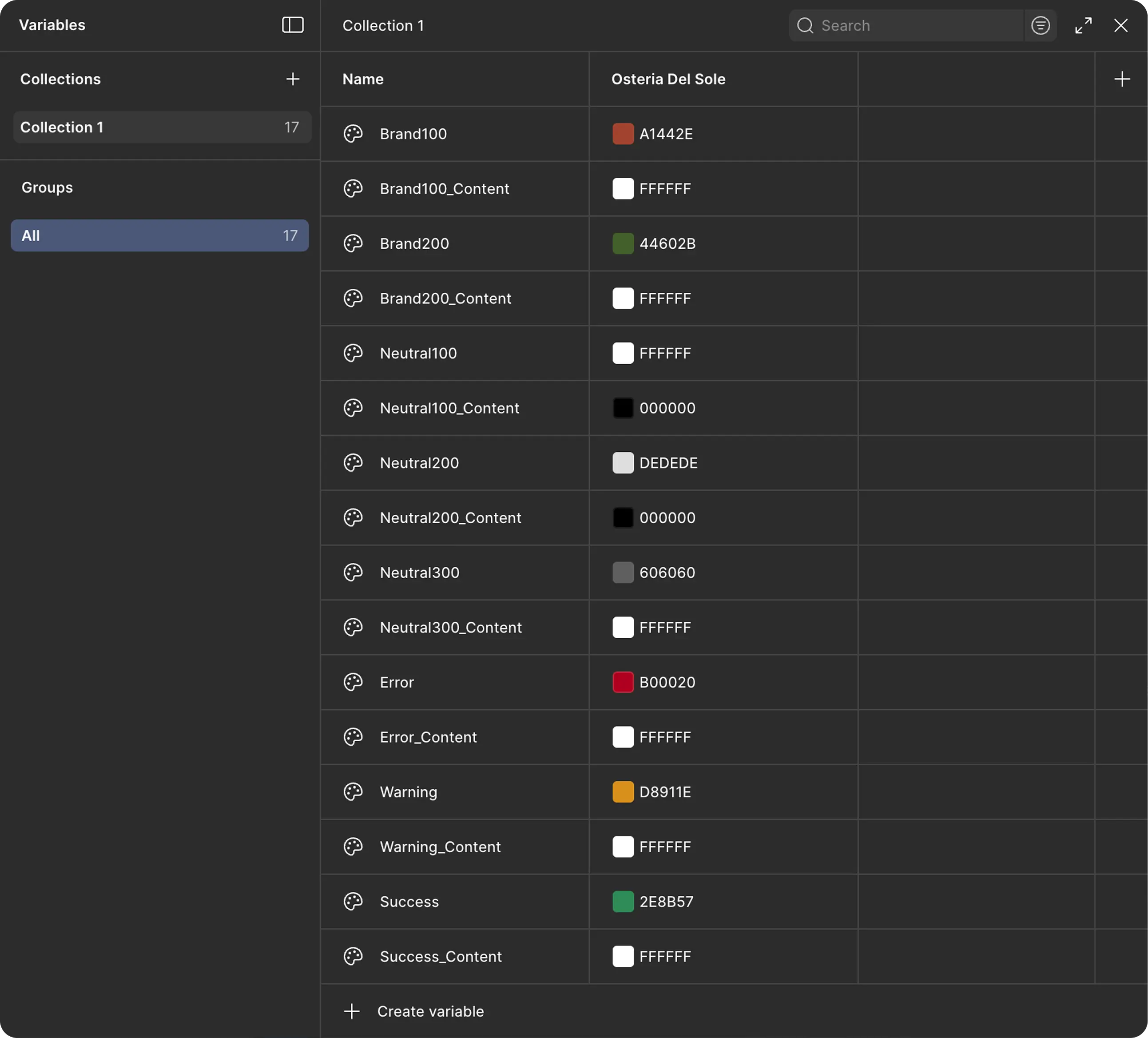
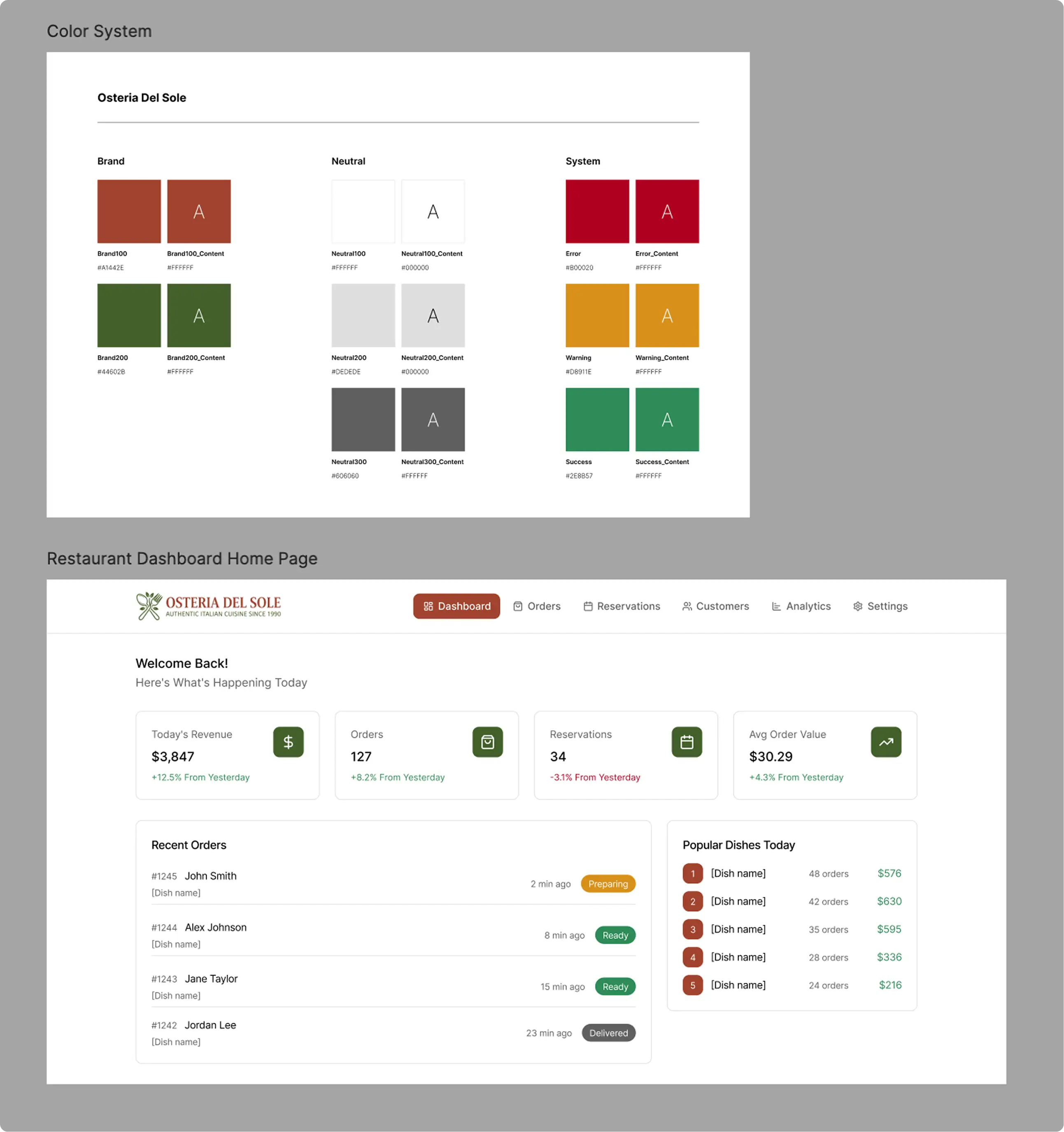
The key takeaway is that variables create a shared language for how values function in the product. When defined thoughtfully, they allow the system to scale without becoming harder to manage.
Styles: Defining What Stays Consistent
While variables handle values that change between themes, styles can be used for elements that are intended to remain consistent across themes.
Styles define the visual appearance of elements such as typography, effects, and spacing. They can reference variables, but their main purpose is to standardize how elements appear throughout the design.
In this example, styles are used for typography. The type scale, font, font weights, and hierarchy remain consistent across all themes, even though colors and branding may change.
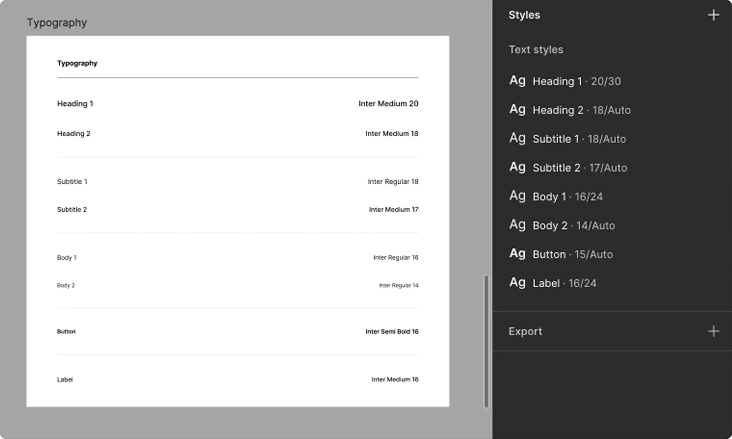
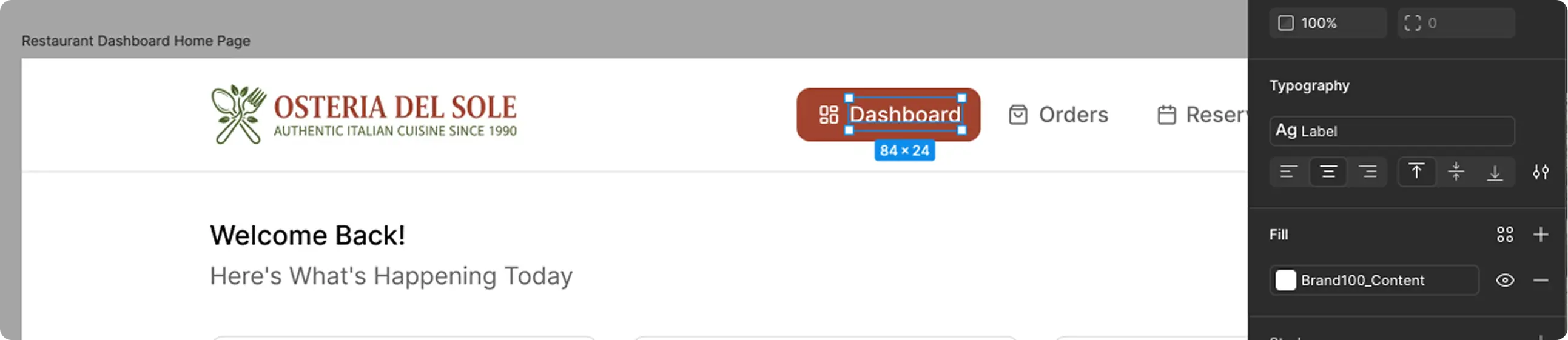
Note: Typography could also be set up as a variable collection if you want it to change between themes. For the purpose of this example, we’re keeping typography consistent, so it’s defined with styles.
Separating variables from styles makes the system easier to maintain: variables control theme-specific values, while styles define the reusable visual structure of the product.
Connecting Components to Variables
Variables can also be used to connect components to themes.
For example, a header component might include a logo. Instead of having the same fixed component, you can use string variables to connect a component variant to a variable. This allows the same header component to display different logos depending on the active theme.
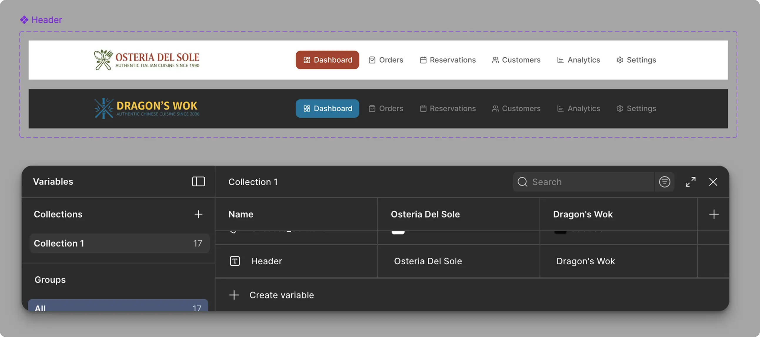
By connecting components to variables, core components remain reusable while adapting automatically to different customers or themes.
Layouts and Mocks: Bringing the System Together
With components built, and variables and styles set up, you can begin building layouts and mocks within Figma.
As layouts are being configured, styles and variables can then be applied and adjusted across components, elements, surfaces, and backgrounds.
This phase is also the time to configure and validate the foundation of your system — ensuring it functions correctly with your initial theme before adding additional themes.
Variable Modes: Creating and Applying Themes
Variable modes act as your themes.
With variable collections already in place, adding a new theme is straightforward. Each variable mode represents a different customer or visual identity with its own set of values applied to the existing variables. In Figma, this means naming each mode after the theme or customer and assigning the corresponding values to the variables.
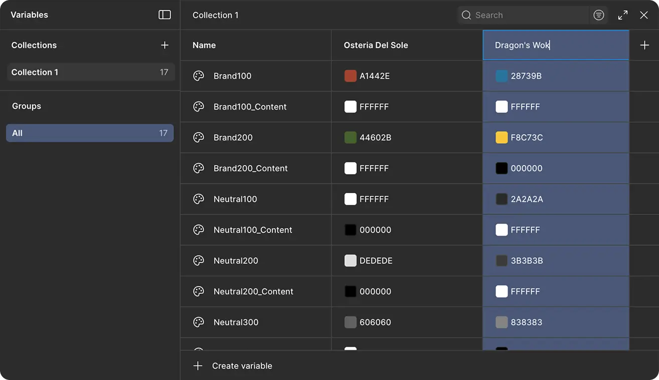
Once you’ve added a variable mode, you can then apply it to any level of your design in Figma. Select a frame, section, group, or other container, then choose Apply Variable Mode under Appearance. The selected mode is then applied across all components and layouts within that container.
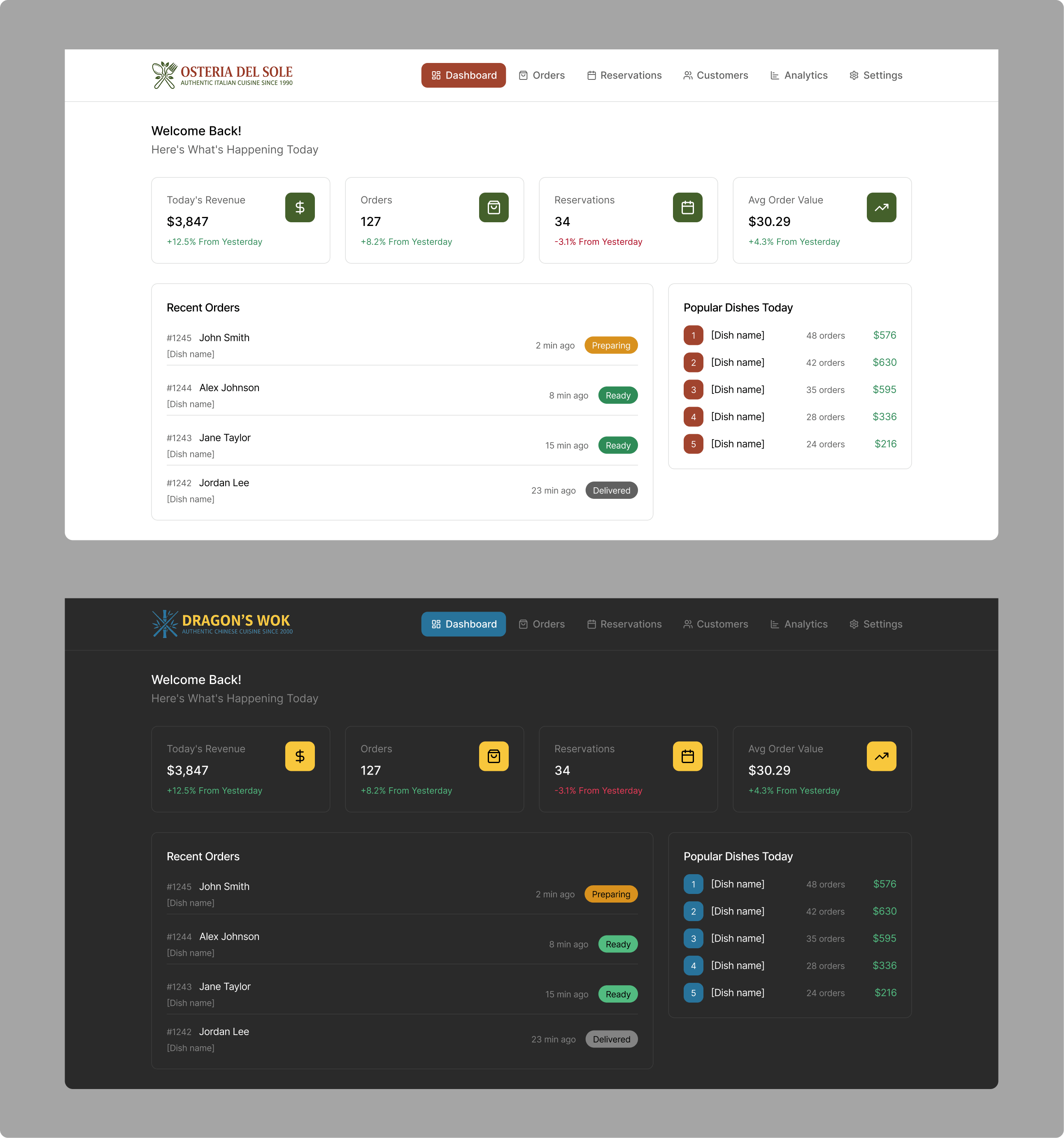
This approach allows you to quickly showcase different customers or themes without duplicating or manually adjusting mocks, thus saving time and maintaining consistency across the designs.
Conclusion
A multi-theme design system allows you to support multiple visual identities without sacrificing consistency or scalability. By leveraging Figma’s variable and style tools, you can create a system that is flexible, maintainable, and easy to extend.
With this foundation in place, adding a new theme becomes a matter of configuration rather than redesign, saving time while keeping the product experience consistent across customers. This approach also improves collaboration between designers and developers, as everyone works from a shared foundation, reducing errors and streamlining handoffs.
Setting up a system like this demonstrates design expertise through thoughtful, strategic planning, and gives customers confidence in both the product and the design process.